I design the things people actually see — posters, social systems, matchday graphics. Type carries the information, photography carries the emotion, grain makes it feel printed.
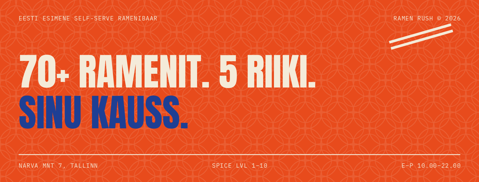
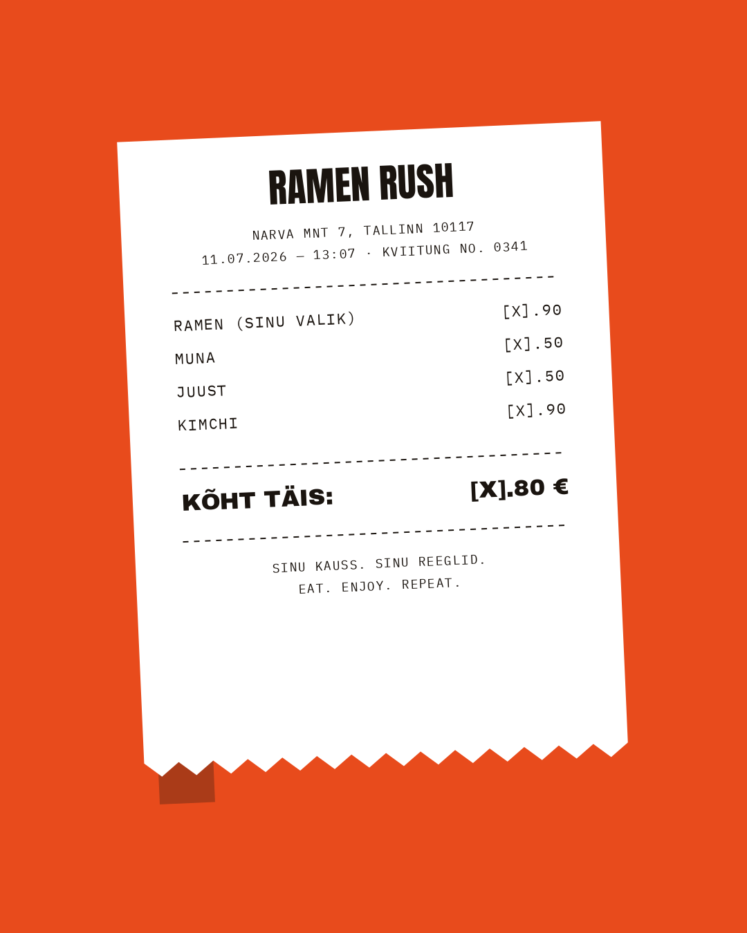
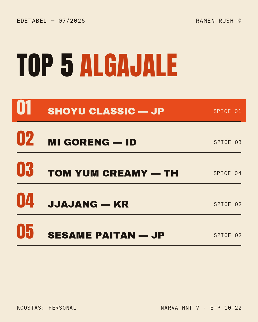
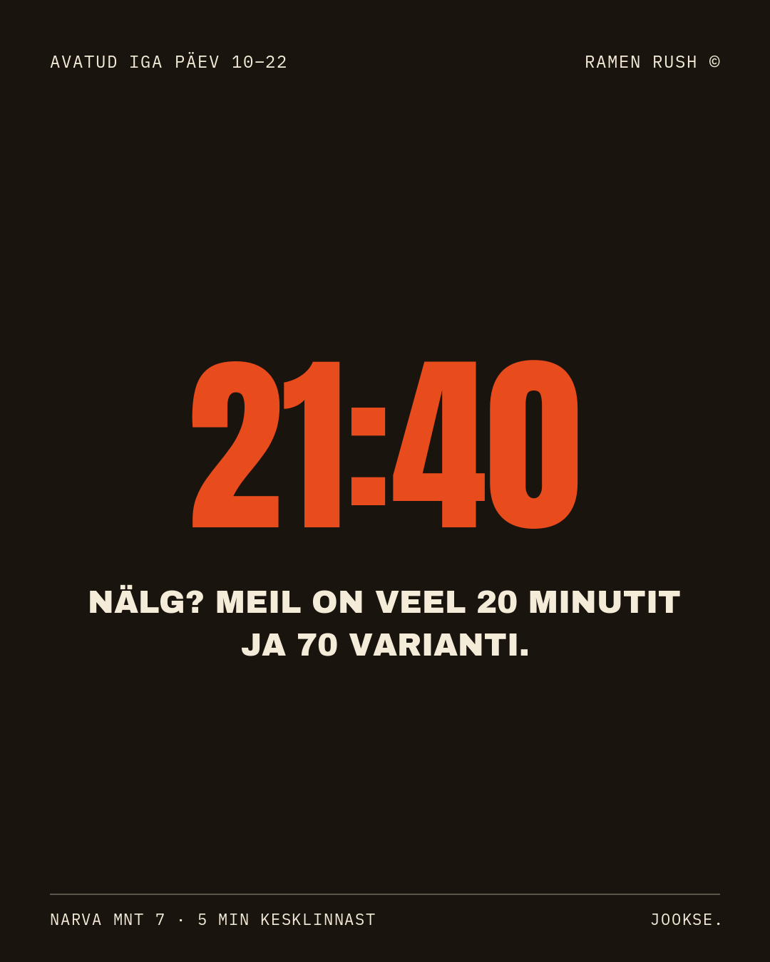
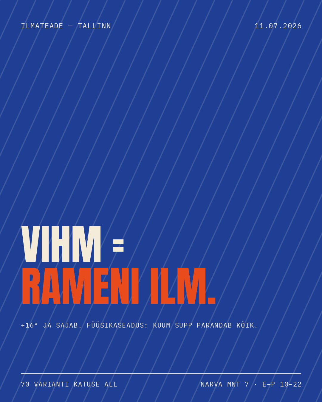
Estonia's first self-serve ramen bar. One wall, 70+ instant ramens from five countries, build-your-own bowls, spice levels 1–10 — and a social presence that told none of it.
I built the whole engine: 28 post templates on a locked 3-color system, a 30-day content calendar with ready captions, Facebook covers, bio architecture, a TikTok format library and a loyalty mechanic (Wall of Flame). Concept and colors untouched — execution turned up to eleven.
A fictional Estonian basketball club, invented to prototype a complete matchday system with no client, no waiting on sign-off, no real names or scores to protect: chant posters, a matchday final, quarter-by-quarter score cards, a player-of-the-game graphic and a season schedule, all speaking one visual language on a locked two-color system.
It's the same craft I bring to real clubs — I just built the client too. Portfolio bait for federations and clubs who want this exact machine running on their real data.
Meie linn ehitab terast, mitte klaasi. Iga mäng peab seda tundma.
Photography carries the emotion. Type carries the information. Texture makes it feel printed. And the small stuff — dates, coordinates, spice levels — makes it feel real.
No lorem ipsum, no fake stats. A poster with the actual attendance number feels like an artifact. Filler feels like a template.
One good post is luck. Twenty-eight templates and a calendar is a machine the client can run without me — that's what I sell.
Digital-clean is forbidden. Everything gets texture, contrast, one temperature push — like it came off a press, not out of Canva.
The design explains itself or it dies on the table. Two colors max, one alignment spine, no drop shadows. Ever.
Full content engines for places people should be talking about — templates, calendar, captions, bio architecture. Built so one person can run it.
Event covers, launch posters, campaign identities. Loud type, real data, print energy — made to be screenshotted and stuck on walls.
Sport is my home court. Matchday announcements, stat graphics, schedule posts and season-long visual systems for clubs and federations.
What to post, when, and why — the strategy layer under the visuals. Pillars, formats, hooks, and the honest numbers afterwards.
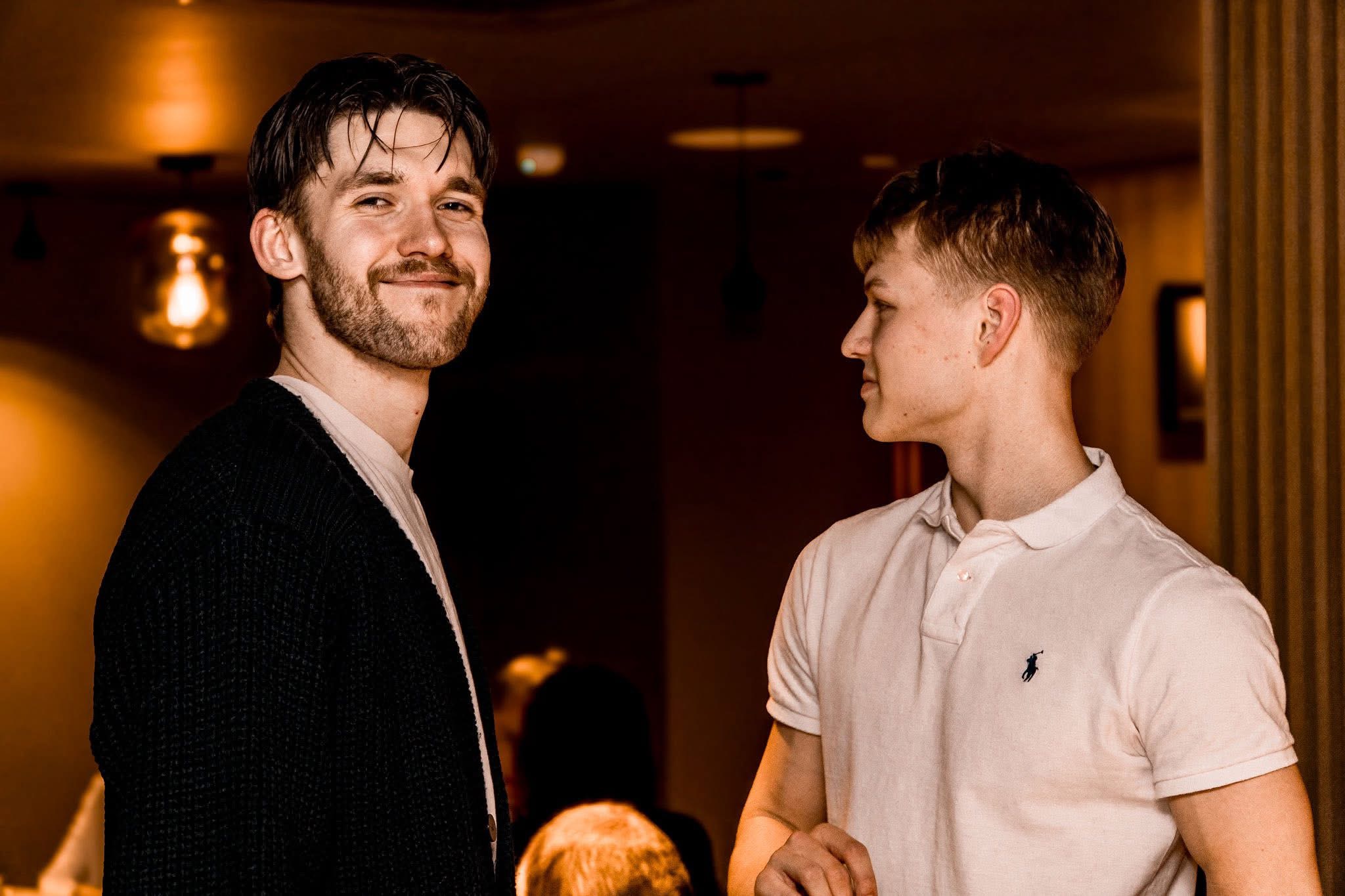
I'm Gerrit — 21, Tallinn. I run ShiftLab Studio, produce content for Maison Division, and play basketball, which is where I learned that preparation beats talent and matchday energy is a design language.
My lane is the culture side of graphic design: sport, food, music, nightlife, hospitality. The work is photo-led, type-restrained and grainy on purpose — closer to a printed artifact than a social template.
If you run a place, a club or a label and your feed doesn't look like your thing feels — that's exactly the job I want.